
ScrollView
import { ScrollView } from "std-widgets.slint";export component Example inherits Window { width: 200px; height: 200px; ScrollView { width: 200px; height: 200px; content-width: 300px; content-height: 300px; Rectangle { width: 30px; height: 30px; x: 275px; y: 50px; background: blue; } Rectangle { width: 30px; height: 30px; x: 175px; y: 130px; background: red; } Rectangle { width: 30px; height: 30px; x: 25px; y: 210px; background: yellow; } Rectangle { width: 30px; height: 30px; x: 98px; y: 55px; background: orange; } }}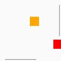
A ScrollView shows a view onto content that is bigger than the visible area and can be scrolled. Compared to a plain Flickable it has scrollbar to interact with.
The ScrollView is scrollable if the content-width and content-height properties
are bigger than the size of the visible area.
If the ScrollView contains a layout, the default value for the content-width and
content-height is the minimum size of that layout.
Properties
Section titled “Properties”enabled
Section titled “enabled”booldefault: true
Used to render the frame as disabled or enabled, but doesn’t change behavior of the widget.
mouse-drag-pan-enabled
Section titled “mouse-drag-pan-enabled”bool(in)default: false
When true, the view can be scrolled by dragging with the mouse. Panning with a touch screen and scrolling with the mouse wheel works regardless of this property.
has-focus
Section titled “has-focus”bool(in-out)default: false
Used to render the frame as focused or unfocused, but doesn’t change the behavior of the widget.
content-width
Section titled “content-width”length(in-out)default: 0px
The width of the scrollable content of the scrollview.
This property was formerly known as viewport-width, which is still available as a deprecated alias.
content-height
Section titled “content-height”length(in-out)default: 0px
The height of the scrollable content of the scrollview.
This property was formerly known as viewport-height, which is still available as a deprecated alias.
content-x
Section titled “content-x”length(in-out)default: 0px
The x position of the scrollable content relative to the scrollview. This is usually a negative value.
This property was formerly known as viewport-x, which is still available as a deprecated alias.
content-y
Section titled “content-y”length(in-out)default: 0px
The y position of the scrollable content relative to the scrollview. This is usually a negative value.
This property was formerly known as viewport-y, which is still available as a deprecated alias.
visible-width
Section titled “visible-width”length(out)
The width of the visible area of the ScrollView (not including the scrollbar)
visible-height
Section titled “visible-height”length(out)
The height of the visible area of the ScrollView (not including the scrollbar)
vertical-scrollbar-policy
Section titled “vertical-scrollbar-policy”enum ScrollBarPolicydefault: as-needed
The vertical scroll bar visibility policy.
ScrollBarPolicy
This enum describes the scrollbar visibility
as-needed: Scrollbar will be visible only when neededalways-off: Scrollbar never shownalways-on: Scrollbar always visible
horizontal-scrollbar-policy
Section titled “horizontal-scrollbar-policy”enum ScrollBarPolicydefault: as-needed
The horizontal scroll bar visibility policy.
ScrollBarPolicy
This enum describes the scrollbar visibility
as-needed: Scrollbar will be visible only when neededalways-off: Scrollbar never shownalways-on: Scrollbar always visible
Callbacks
Section titled “Callbacks”scrolled()
Section titled “scrolled()”Invoked when content-x or content-y is changed by a user action (dragging, scrolling).
ScrollView {    width: 200px;    height: 200px;    content-width: 300px;    content-height: 300px;    Rectangle { width: 30px; height: 30px; x: 275px; y: 50px; background: blue; }    Rectangle { width: 30px; height: 30px; x: 175px; y: 130px; background: red; }    Rectangle { width: 30px; height: 30px; x: 25px; y: 210px; background: yellow; }    Rectangle { width: 30px; height: 30px; x: 98px; y: 55px; background: orange; }
scrolled() => { debug("content-x: ", self.content-x); debug("content-y: ", self.content-y); }}© 2026 SixtyFPS GmbH